in reverse order

since this is a blog, you have to go to the very bottom and read them in reverse order. eventually, there will be pages across the top where you can read chunks of information in a logical order. this is all free posting, so, maybe that is why it has to appear in reverse order.

Wednesday, October 7, 2020

Samples for H.A.

On all of these - imagine them in other colors - to coordinate with whatever stamps you choose.

The last envelope has a Celebrate stamp that has colorful polka dots. That stamp will be available fro quite a while and because it has so many colors - it is an ideal choice for your project.

These are actual envelopes from my blog. 
I probably won't be able to do any new examples until I get home. 
But, these show a nice range of options.

The prices are for addressing only.
Envelopes will range from 25-cents apiece to $1 apiece depending on the envelope.


Imagine this in a different color to coordinate with the stamps.
The apples and strawberries are only available in coils of 3,000 stamps. I have no idea who uses them. But, they are not available for your project. I'm sure we can figure out a nice design with one of the stamps that is available.

To letter in one color and add white would is $3 per envelope.


A script name with one flower is $2 per envelope


This is done with a scroll tip and to do it in one color is $2 per envelope.
To add the gold dots is an additional $1 per envelope.


These are very time consuming - $5 per envelope


Quick and easy - $1.50 per envelope


Time consuming - $7 per envelope


Sunday, January 21, 2018

2 Penmanship PDFs + Zanerian + Vitolo

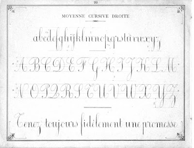
Two penmanship books with easy to follow lessons.
Both are available at the IAMPETH website and also at this archive:

Italian book

French book


The Zanerian Manual is available for download here:

Zanerian Manual

Mac people may download Dr. Joe Vitolo's eBook at this link.

Vitolo eBook for Mac

PC people may download a PDF here:

PDF of Vitolo book

To watch his videos, if you are PC, you will find them at:

Vitolo videos

Monday, December 18, 2017

Word spacing

This example shows traditional word spacing. The amount of space between each word is equal to the amount of space that it would take to write the letter i.

When you leave more space it can be distracting. When the word spaces line up in a vertical or diagonal line, it looks like a river of white space flowing through the paragraph.

I circled the *rivers* and spaces with a red pen to point out the areas I am talking about.

I inserted the letter i in three places to show how much closer the following words should be. The slant on the i between the-snowfall is way off. Please ignore that detail and just look at the amount of space.


Thursday, March 3, 2016

more versals

by the ineffable nancy hills
another one by nancy hills
another one by nancy hills. one of my all time favorites
one more by nancy hills
this was a very quick rough idea of mine for how you can versal-ize any font that has some heft to it
on this one i was actually trying to do spend some time and make something as lovely as nancy's. it is so much fun to try to match the grand masters. it doesn't matter how close you get. it's not the content, it's the process. like singing in the shower.

by jean. quick and easy. largest copic marker, smaller zig marker for the purple. the white is paint pen and gel pen. and yes, there was a mistake under that stamp on the left. probably one under the A as well. my work looks pretty elementary next to nancy's, but if you have never done versals, you could start with something easy. nancy has spent a lot of time making art and taking workshops. so, there is a reason her work is so spectacular.


Wednesday, March 2, 2016

versals

the topic of these contemporary versals came up on the flourish forum, so i decided to post a bunch of them here rather than clog the forum


my work
my work

my work, gel pen and colored pencil

my work, g-tec pen
nancy hills' work

Sunday, February 1, 2015

Flourish No. 5

These caps are all built off a clockwise loop. You may keep it as a spiral (open) curl or you may have it cross over.

The W in the top row is a sad tear-drop shape. I left it in so that you could compare it to the others. Avoid the tear drop shape. It is sad and droopy. Keep all your curls nice a fluffy and round. Think of a big fat cinnamon roll. Yum.

Flourish - No. 4

The next set of letters. These all start with a loop that is made counterclockwise. The loop may be open or overlapped.

There is a second variation called a Spencerian loop because it was inspired by Spencerian. It might be the easiest loop of all. but, you should try all of them and see which ones feel the best to you.

This started as lessons in flourishing, but evolved into a set of caps that have some flourish.