in reverse order

since this is a blog, you have to go to the very bottom and read them in reverse order. eventually, there will be pages across the top where you can read chunks of information in a logical order. this is all free posting, so, maybe that is why it has to appear in reverse order.

Thursday, November 27, 2014

Flourish no. 3

Here is a flourish that has a few variations. Choose one that you like and then build 13 capital letters off of it.

The choices at the top are roundish, then oval.
With ovals, you can have them more vertical or more horizontal.
Be consistent with the overall shape of the oval.
If you go round, keep them all round. If you go slanty, keep them all at the same slant.

Keeping the shape and the slant (if there is one) the same allows you one variable and that is size.
You can adjust the flourish to be larger or smaller depending on the letter.

Other choices are if you have a curl that does not overlap. I call that a cinnamon roll. Keep them big and yummy. You can curl them around so they over lap like the first one in the second row. I calls those fish.

Looking at the third row, the second one, overlaps and then curls in on itself. I call that the kidney bean.

And I do not have a name for the second one in the top row. It has that little extra loop inside the major loop. I guess I will call that the *DeLuxe* model. You can't make those until you have mastered the basic ones.

And what are the pit falls. Pig tails. Don't make flourishes that look like little corkscrew pig tails. Unless you are doing something really whimsical. It's a matter of personal taste. I love whimsical, quirky, naive, rustic, outsider lettering. But, it's a little like dessert. Too much of it makes my teeth hurt. Unless I have some good reason to go on a dessert bender. I try to stay away from making any absolute edicts on what looks right.

This page has nice fluid, quickly done without any practice....flourishes.
As every instructor I ever had says...you only make nice flourishes by making a lot of them.
I like to just toss them off.
If I have a job where I am doing a lot of flourished envelopes. The first 25 will be fine. But, after that, the next ones always look so much better -to my eyes.  Nobody else can tell the difference. But I can.

Happy Flourishing

Sunday, November 23, 2014

another link - or 2

i've been writing words on wrapping paper for years. these are not mine, they are from this blog
http://www.papernstitchblog.com/

scroll down to find them

i have not had time to surf around and see what else is on that blog..
this is a link to the original post with the lettering on wrapping paper idea.

http://shopwalkinlove.com/blogs/walk-in-love/10846953-inspirational-wrapping-paper

i have not had time to surf around that blog either.

Tuesday, November 4, 2014

more stuff already online

http://julieblanner.com/learn-calligraphy/

i keep finding more and more stuff online that has tutorials for lettering.
so, i am not really motivated to keep adding my own quick and easy lessons

u-n-l-e-s-s

readers tell me what they want.
so
if you have been following the flourishing  - or started on the upright script
and you want more
you need to either leave a comment
or
email me at jmwilson411 at  yahoo  dot com
and tell me that you want more
i'm happy to add things, if you are finding these lessons helpful
but
if you are all going on to other things, that's fine.


Sunday, October 26, 2014

Flourish No. 2

Here is a variation of the basic figure-eight that you can add to the end of a word. Fig. 1 shows a small version. The tiny arrows show that it is nice to balance the amount of depth and height on the flourish and when you are deciding where to stop, aim for the middle of that oval that you created. The tiny word to the right was trying to illustrate that if you keep the flourish to the same size as the letter, it is probably a little too small and crunched. But, maybe you like that look.

Fig. 2 shows a full line drop at the beginning and then swoop up, a full line in height and then after the left loop of your figure-eight is done, be sure you fling an equal distance to the right. The final curve is loosened up, so you do not see an implied figure-eight.

Fig. 3 is the same as 2, but it is a little larger. The sad face is pointing out that if you think about things too hard, you might have an awkward transition from your letter to your flourish. Avoid doing that by making 300-400 flourishes until they just flow spontaneously. Pencil is good for practice.

Fig. 4 shows a more traditional figure-eight up in the air. This is an option if you forget to drop down on your last letter and just have to add it on at the last minute. You can see the implied figure-eight where the dotted line finishes up the second loop.

Fig. 5 shows the size I like to make flourishes. I am much better when I fling a really big flourish and use my whole arm. It takes hundreds and hundreds of flings to get to the point where you can fling them and every single one is pretty. But, the good news is....it's like riding a bike. Once you get the feel for a big loopy flourish, you can't forget it. I was trying to make those two little *bad* examples....and they really aren't as bad as I had hoped to make them. I suppose I could go out on the internet and find examples of *bad* flourishes. But, I really don't want to judge. If someone is just trying to figure it out on their own, with no lessons, I am still happy that they are trying. Some of the quirky, jerky, contorted flourishes are full of happiness and love....so, I refuse to label them *bad.*
They are welcome in my world. If people want to learn some flourishes that are little more refined, that's fine, too.

Thursday, October 23, 2014

Dr. Joe Vitolo's Book

Dr. Joe Vitolo spent a lot of time creating an ebook with videos that you can download - for free. It is in the Apple format, so if you are a PC person you can only download the PDF. There might be a way to watch the videos on a PC. I will figure that out and update this post, once I know.
In the video section of the IAMPETH website, you will find all the videos that are included in the book.
Scroll down to the ones that are by Dr. Joe Vitolo.

http://www.iampeth.com/videos.php

It is a very thorough book and covers everything you need to know about copperplate. I'd love to hear from someone - anyone- who has the patience to do the lessons. There is so much information. I think it might be intimidating. But, I also think it might be a fantastic way to learn if you are not able to take a course in person. Keep in mind, he has many tips about paper, ink and nibs that are useful even if you have no interest in traditional calligraphy. If your goal is to write contemporary, quirky scripts, you will still benefit from watching the videos.

This is a reprint of one of his recent posts, reminding people how to access the book:

Just a reminder that my free interactive iBook, ‘Script in the Copperplate-Style’ made specifically for the Apple iPad and Mac’s running OS Mavericks is available for immediate download. This is the first interactive iBook for Pointed Pen script.

The multimedia instructional materials contained within will help both the novice and advanced students. The fundamentals of Copperplate-style calligraphy are the focus of this Book with particular emphasis on letterforms. In addition, advanced concepts including Needle Stitch Script, and Gilded Script are explored.

This iBook’s more than 80 pages are packed with instructional text, images and more than 35 instructional videos presented in an interactive format that will allow the student of the art form to accelerate their learning.

http://itunes.apple.com/us/book/script-in-copperplate-style/id547108521?ls=1

A NOTE TO MAC USERS: iBooks is now available on your Mac desktops and laptops if you have upgraded Apple’s latest Operating System. This means that anyone with a Mac computer running the new OS 10 can now download and view my instructional iBook directly on their computer!

The use of ‘guidelines’ in script writing (Copperplate, Roundhand, Engrosser’s/Engraver’s script) is essential for the novice. The guidelines serves as a ‘grid’ that allows one to learn not only consistent x-height and slant angle but also the proportions of the letterforms. There are many expert script writers that only require a single baseline to write beautiful script. However, the novice must take the time to learn the forms first before discarding all the lines. It should be noted that some experts still use guidelines too. Once you learn the fundamentals THEN you can experiment with different letterforms. The guidelines that I use in my free instruction videos are available online at:

http://www.iampeth.com/lessons/guidesheets/VitoloScriptGuidelinesFromVideoClips.pdf

I also created a video on ‘How to Use Guidelines’. You can view it at:

http://youtu.be/YNOfcL1pGc4


Tuesday, October 21, 2014

The Flourish Forum

Speaking of flourishing....I am going to recommend The Flourish Forum as a resource for anyone who has time to surf around and find discussions and examples on many topics relating to penmanship, calligraphy, and lettering. It includes both traditional as well as contemporary styles.

I will be posting some links I find on the forum that pertain to the topics we are covering. The Flourish Forum was created by Erica McPhee who is a penpal from way back.

http://theflourishforum.com/about/

You may see Erica's portfolio at her website:
http://paperwhitestudio.com/

Flourish No. 1 - Part 2

Hopefully you have done about 100 flourishes on a j, y or g. This page shows how you make the same flourish on a b, h, d, or k. You simply turn the page upside down and do the same flourish.

The l is a little trickier. You have to be pretty careful when you join the stem to the base part of the letter.

Notice the same flourish can be done on a slanted letter as well as an upright letter.

Pulling a pretty cross bar on the t utilizes the same graceful curve.

The second and third y's show how to loop back over - completing the figure-eight and ending in a loop.


Sunday, October 19, 2014

Flourish No. 1

If you have The Speedball Textbook, be sure to look at the two pages on flourishing. There are some nice basic flourishes right after the italic pages.

To the right is the first flourish I learned and I used it for about two years before I went on to any other flourishes. It is a figure-eight and it is a good idea to start out on lined notebook paper with a pencil, ballpoint, gel pen, marker or anything that is easy. I would not start out with a dip pen.

The most important thing is to practice large. Fill up at least two spaces, vertically and the width should be at least 3.5 inches wide.
Or 9 cm wide - I think...I am not very good at metric. This will force you to use your whole arm.  I will look for a video online that shows whole arm movement or make my own.

First make layers and layers of figure-eights until you have some nice muscle memory.  Then try just the portion that is shown in the solid line - that also has a dotted line. You can see at the left end of the dotted line that I have a little too much curl on the beginning stroke. Beware of making fish hooks and pig tails at the beginning and end of a flourish. Those are tight little hooks and curls that do not stay close enough to the figure-eight.

Then try pulling a flourish off the bottom of a y or a g or a j. The first amy shows a very large flourish. the second one is a little smaller and the third one is too tight to my eye, but if you are addressing envelopes, you may choose to tuck in a small flourish. In general, you will want to have a little space between the word and the flourish.

Keep the flourish level, for now.
Keep the two halves symmetrical
And do a lot of practice of the one that is layered over and over to create some muscle memory.

Another good tip is to breathe. Students frequently hold their breath as they start a flourish because they are nervous. Holding your breath is not helpful. Keep breathing and pay attention to this next bit of advice...this is a really valuable tip.... make your flourish  IN THE AIR just above the paper....a couple times....to get the muscle memory. After you make the shape a couple times, then let your pen hit the paper and because you have visualized exactly what you want, you will surprise yourself at how close you get.

Saturday, October 18, 2014

Other Scribes and a Tutorial

You could spend a lot of time at this site looking at a variety of tutorials. This is the most recent.

http://antiquariavintage.blogspot.com/search/label/calligraphy

Click on Mrs E & Mrs B to read about the two ladies who run the blog.

I am finding so many tutorials on line that I hesitate to create any new ones. I might continue to post things I find. If readers have specific questions....ask away.


Thursday, October 16, 2014

Other scribes

Here is another scribe to listen to: Jake Weidmann
He is literally a Master Penman. There is a process to being designated a Master....which you can read about at the IAMPETH website.

His talk is about 15 minutes long and full of interesting information about the value of writing by hand. Enjoy.

https://www.youtube.com/watch?v=85bqT904VWA

You may see more of his work at his website and see another interview at the IAMPETH.com website

http://www.jakeweidmann.com/

http://www.iampeth.com/penmans_studio_Weidmann.php

Jake:  If it is not OK to repost this to my blog, please let me know and I will remove it. I could take time to email you and ask permission, but, then I would not have time to keep my blogs going and I trust you are happy to have people linking to your website :-)


Monday, October 13, 2014

Layout

From a 1927 Speedball guide written by Ross F. George, type designer and inventor of the Speedball pens. 
I have found so many other tutorials online that i am re-pondering if i am going to repost things that are already out there rather than create new stuff. it seems like there is already so much that it might be a better use of time to have this blog be a directory of where to go for the type of work you want to do. this is from the 1927 issue of The Speedball Textbook.
If anyone has questions, be sure to ask them in the comment section and I will respond. I had a request for discussion about markers and will be posting my thoughts later this week.
 

Wednesday, October 8, 2014

Other Scribes

http://handletteringtutorial.com/ryan-hamrick-hand-lettering-tutorial-series/

This just popped up on Pinterest.
I have not had time to read through any of it, so, if there is someone out there who has time, let me know what you think.

I will update this post when I have time....  :-)

Tuesday, October 7, 2014

Every day?

I don't think I should make a vow to post every day on this blog. I am happy to do so on the envelope blog, but, it will probably be easy to add a post here every time I have a comment from a reader. Amy responded that she has not settled in on any particular style, she is still getting acquainted with the nibs and ink. And having fun. That's a very good way to start.

Here is a fun bouncy pointed pen mane that I wrote. It is on that sparkle paper. Sparkle or shimmer papers are very popular and I find them to be very friendly to the pointed nib. The hairlines on this one are rather clunky, but it doesn't bother me. I love super fine hairlines but some paper and ink combinations do not yield fine hairlines....but if the nib feels good gliding along the paper, it doesn't bother me to have clunky hairlines once in a while. I like variety.

And, here is the tip of the day.
I am not sure how many books mention this and I do not have time to research today.
I'll just mention it as one of the things you need to know.

There are natural oils on your skin including that part of your hand that touches the paper when you write. So, if you are filling an entire page of lined notebook paper and your hand slides back and forth across the paper, by the time you get to the bottom, you may have trouble with the nib skipping. And that might be because of the oil. So, you may want to use a guard sheet under your hand. A few scribes wear fingerless gloves, but that sounds clumsy to me. Or maybe it is the best solution ever. I really should try it some time.

I mostly do envelopes, and so I usually do not have a problem with oily build up on the envelope. When Mr. Legend commented that he was having trouble with the nib skipping, I didn't include this as a possible problem because I forgot about it. If the skipping does not happen at the top of the page, but becomes a problem as you go down the page, then you might want to try a guard sheet.

Some people tape the guard sheet to the desk and then tuck the paper under the guard sheet and pull it up as they write. This is a really good idea because it keeps you writing in your optimal spot - vertically. Too often, people zone out and write line after line and eventually, their hand is at the very edge of the desk. There is a sweet spot, right in front of your nose where your writing will be better. If your hand is falling off the edge of the desk your writing will suffer.

It is also important to move the paper (to the left) if the line you are writing on is wider than about 4 inches. As your hand gets too far to the right, you do not have a direct line of vision and your arm is reaching out and it is harder to maintain consistency in anything. If you are writing LARGE, then you might be able to write longer lines. But for small writing, make sure that you keep the sweet spot right in front of you.

Another way to have a guard sheet is to place a blank sheet right under the line where you are writing. This works well, except when you jiggle and smear the ink. And, it is really important to know that the edge of the guard sheet will be much friendlier if it is a folded edge. The actual edge of a sheet of paper is rather sharp. Your hand will not glide smoothly when it moves up and down across the edge. So, fold the sheet of paper and put the folded edge under the line where you are writing and it will be a nice smooth edge. This seems like a very minor point, but I actually consider it a cardinal rule. If I ever need a guard sheet and I just grab a sheet, without folding the edge and try to get by with the sharp edge, I inevitably snag my hand on the edge and goof up the writing. So, you may take my advice or learn the hard way. Or maybe you have been using a sharp-edge guard sheet for decades and never have any problems. There are no absolutes to any of this. Just try everything and you will find what works for you.

I'll post a photo of my favorite type of guard sheet pretty soon. I have a couple actual jobs with deadlines to tend to today :-)

Monday, October 6, 2014

Quirky Sample

Mr. Legend is an advanced student, working on Spencerian. Amy said she was practicing, but I am not sure which style she is practicing. Maybe all of them at once.

Traditional teachers will say that it is essential to focus on just one style until you have a good grasp of that style. Then, you may move on to other styles. I agree, but only 50%.

I am pretty much 50-50 on everything. That is a lesson I learned from my physics teacher in high school. He said that in reality, every rain forecast was 50%. Maybe it will rain, maybe it won't. Then he had a more comprehensive lesson on weather forecasting and calculating all the various things the weathermen calculate and he probably intended for me to learn something else, but instead, I just went with the 50-50 rule and I apply it to e-v-e-r-y-t-h-i-n-g. It makes life easier. A perfect balance between optimism and pessimism.

Returning to the topic of whether or not you should focus on one style at a time. Maybe. Maybe not. If you only have a copperplate book, then, it would be a good idea to focus on copperplate for a while. If you have The Speedball Textbook, you might want to just go ahead and try every single style in the book to see what happens. In my years of teaching, I was frequently surprised when a student who was not having any success with the first few styles I offered would suddenly try one that was a perfect fit for them and *voila* they were off and running.

So, do not be discouraged with your penmanship or calligraphy studies until you have tried every single style there is. You won't know until you try. If you are enjoying the very first style you try, stick with it for as long as it maintains your interest.

If you are flighty and want to try everything, let me know. I can start putting up a ton of alternatives. But, I don't want to bombard you with too much at the beginning.

The sample today is a quirky script. Compared to the upright exemplar I posted, it is elongated and slanted, but the shapes are generally the same as any script. I drew some wonky guidelines as a design element and chose a matching stamp. It isn't spectacular. But, it is an adequate idea to make a birthday card or thank you note a little more interesting.

Saturday, October 4, 2014

My Slanted Opinion - 1

Here is a shout out to Amy who left a comment on the spooky experiment post. I always enjoy hearing that people become so engrossed in their practice that they *forget* to do their chores. Yay Amy!! She mentioned that she was "a little unimpressed" with the Molly Thorpe book, Modern Calligraphy. I think the main problem with any instructional book when it is written by one person - is that you only get one perspective. And sometimes, an author will leave out an Essential Tip.

We each have a unique path that started when we were about 5 years old and penmanship is something that grows and evolves. We are products of our teachers. Some of us have had between 20 and 30  teachers. I am guessing that Molly has not. But, she does include a ton of valuable information for people who are just starting and want some success at a modern style with nibs and ink. Trust me, it takes a long time to study with 20-30 different teachers.

I am going to go through all three books by single authors and add some information that I think will help everyone get more out of the individual books. The essential tip for the day is slant. Eleanor Winters and Gordon Turner both recommend the 54 or 55 degree slant that is traditional with copperplate.

If Molly Thorpe included any discussion about slant, I have not found it. And when I flip through the book, I see a variety of slants which is a huge no-no in traditional copperplate. It is perfectly fine in modern calligraphy to have a variety of slants. Since Molly does not mention slant (correct me if it is there and I just missed it) I think the reader is missing some essential information. Her block lettering is mostly upright. Most of the time, her slant is about halfway between 90 (which would be straight upright) and the traditional 55-degrees of copperplate. It's a very nice slant. But, the part where she does not even talk about it leaves the reader with some missing pieces to the whole puzzle.

In my discussions with some of the rock stars in the world of calligraphy and lettering, many of them have agreed that most people have a natural slant. And....it can be very beneficial to use your natural slant when you are first learning a particular style.

MUSCLE MEMORY. I talk about it all the time. If your muscles have been cruising along, making the same slant for decades...stick with that slant.

YIN YANG. And even though, I just said to stick with the slant that is your natural slant....now I am going to tell you to try different slants.

WHY DO I CONTRADICT MYSELF? Because it helps you to integrate your muscle memory with your new skill. And this is why I will never write a book. There are too many ways to approach lettering. None of them are right or wrong. It is hard to predict which approach will yield the best results. As Mr. Legend wrote in his comment....the only thing that is a given...is that you'll need to put in some time practicing.

My envelope pictured above is one style that requires very little practice. I wrote amy spencer amy spencer with a very fine pen. Then on the last 3 names, I put in a second stroke wherever the stroke was a downstroke. on *spen* you can see the double strokes. on the *cer* i added some tiny cross strokes. on the second amy, i filled in the double strokes and on the second spencer, i went over the fine line with a bolder pen and put about three layers of extra width to build up the down strokes. so, there you have it.... 3 versions of faux calligraphy. fun. easy. minimum of practice.

Molly Thorpe seems to be doing just fine by using her personal slant (73-degrees) and embracing inconsistency. Gordon Turner has one page (33) where he shows some alternate styles that include different slants. I did not find any examples of variations of slant from Eleanor Winters. She simply recommended 55-degrees.  She explains the math behind the 55-degrees in such detail that your brain could easily explode if you are math phobic. This kind of detail can be very off-putting to beginners. Don't worry. I'll be happy to help you find an easier way if you don't like all that math.

If you are working on traditional copperplate, you might want to try all the lettering, exactly as it is presented in the books...but if your natural penmanship has a different slant, try using your own slant and see what happens. If you want more advice on this topic, leave a comment and I will post more.

With traditional copperplate, it is my opinion that you really need a lot of practice on paper that has slant lines. So, the easiest thing to do is buy a the copperplate practice paper from John Neal.

P01-8. JNB Copperplate/Engrossers Pad 8.5X11in

I prefer the 8.5 x 11-inch pad and will include my reasoning in a separate post.

You can also print out your own paper with guidelines.
http://www.iampeth.com/lessons_guidesheets.php
But the John Neal practice paper is much better paper than the do-it-yourself method.

Friday, October 3, 2014

Oblique nib holder

http://www.iampeth.com/lessons/getting_started/Don_and_Ron/don_and_ron_page0.html
That link will take you to 7 photos with notes to help you figure out the oblique holder.
www.iampeth.com has a LOT of information. I will cruise through from time to time and pull out things that look helpful. Feel free to go through everything on your own.


Thursday, October 2, 2014

Links to Everyone Else

Anyone who knows me or *reads* me knows that I am a big fan of one cup of coffee and an hour of surfing every morning. Then one cup of coffee and an hour of surfing at noon. The rest of the day is spent on my penmanship and a few other chores.

During my surfing, I run across many other people who are infatuated with penmanship. Yesterday I found Emily Schuman who has this blog:

http://cupcakesandcashmere.com/diy/faux-calligraphy#feed=/tag/paper-goods

I will be posting every example of fun quirky lettering that I find so that you may benefit from comparing all the different techniques. Hopefully, you will not get lost looking at all the other fun things that Emily has on her blog. She is young and stylish and for now, she has time to dabble in design in every aspect her life. She has a husband and two dogs. Over the years, I have seen several blogs run by young enthusiastic designers who eventually have a baby and then the blog phases out. A few of the young mommies manage to keep their blogs going. If you are young and trying to learn how to write with nibs and ink, good for you, this is an energetic time of life and you will do well, if you can squeeze in some time to practice. If you are old and have lots of spare time, congratulations, you have found a perfect activity to master. And if you are somewhere in between, still juggling work+play+responsibilities...penmanship is easy to do in bits and pieces and you will enjoy what a flexible activity it is.

I will label all the links to other people who have tips and lessons on penmanship and calligraphy - OTHER SCRIBES.  It is unusual to lump all the scribes together. Some of them are supreme masters, others are crafty DIYourselfers with no training whatsoever. Why am I lumping everyone together? Because they do have one thing in common. They are all writing words. It is too complicated to create categories. I'm lazy. I'd rather focus on YOU finding your own style and enjoying the variety.

Emily's style is not a nibs-and-ink style. So, if you have not purchased your nibs and ink, you can still practice making lettering that looks like it was done with nibs and ink. Understanding that the thicks are made on the down stroke and the upstrokes are thin is an essential part of the process. Is there anyone who does not understand thick-down and thin-up?

Tuesday, September 30, 2014

Spooky Experiments

Mr. Legend left a comment about his nib skipping. I brainstormed a few possible solutions. Then I tried some random swoopy motions. If you have never tried writing with a nib, try some wavy lines. I made some rows of letters that are a common exercise in Spencerian. At some point, I might talk about Spencerian, but for now, let's stick with the first exemplar that I posted. The first line of actual words is from the exemplar.

Then I tried to make some quirky, spooky writing by making everything less uniform. The third line is scrunched - then angular - then slanted. The writing explains the thought process.

Then I Googled *spooky lettering* and some fun Halloween cards popped up. I redrew the three figures, making them significantly different than the original. I can't really decide which one I like best.

Hopefully, if you have your nibs and ink, you can try some quirky writing and let me know how it goes.

I will wait to hear from the people who expressed an interest in trying nibs and ink, to see if they have their materials. I also need to know if anyone bought a book. Which book you are using will determine what kinds of comments I make.

If you just want to use the exemplar that I recommended (rather than any of the books), please let me know.


Wednesday, September 24, 2014

Essential information

Computers sometimes refuse to post photos in the right direction. We won't let it bother us.

I forgot to mention something that is essential to nice lettering with nibs and ink. It is really hard to make pretty lettering when you have a single sheet of paper on a hard surface.

You need some *cush.*

The easiest thing to do is write on a stack of 4-6 sheets of paper. If you look closely, you will see faint lines in the photo. There is a sheet of lined notebook paper under the sheet of photocopy paper. That's an easy way to give yourself some guidelines.
Or you may just write on notebook paper.

You need cush with all kinds of pens and markers. I imagine a sheet of blotter paper would be perfect.
I'm sure you can still find blotter paper somewhere.....

And conversely, beware of writing in a notebook. When you start on the first page and the notebook is 1/4 to 1/2-inch thick, as your hand gets down to the bottom of the page, it will be falling off that edge and you will not be able to write neatly. I am pretty emphatic about discouraging students from writing in notebooks or on tablets. I think loose sheets are much friendlier. As Mary Jones says: That is just my opinion, but I am right.

Spencerian tips

Mr. Legend left a comment and mentioned that he was having trouble with the nib skipping on the upstroke on his Spencerian. This style is one of my favorites. The image is from Bill Kemp's webpage
http://www.billscalligraphy.com/spencerian.html

Bill is a past president of IAMPETH.
I will do a post about IAMPETH at a later date. But you could Google it and surf around their website.

Possible problems - and all of these suggestions apply to any of the pointed nib styles:

1. Slant - of paper and pen

How much you slant your paper is something to consider with all styles.
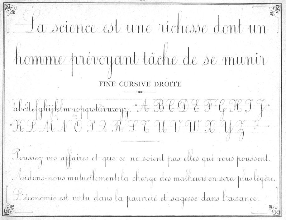
Spencerian is sometimes referred to as a running hand and the books teach cross-drills which are fascinating exercises where you fill the page with rows and rows of rhythmic lines of the same letter
eeeeeeeeeeeeeeeeeeeeeeeeeeeeeeeee  only in script. IMHO, you need to find a slant that is comfortable
and then keep your nib rather *flat* - I do not have any success with Spencerian when I let the nib go up on its tippy toes - with the pen holder nearly vertical. To keep the nib rather *flat* you can't have your hand too close to the nib. If your nib holder is hour glass shaped it might be forcing your hand to be too close to the nib. You might need to get a straight holder so that your hand is a little further away from the nib.That is the advantage of a straight holder. Although, I like hour glass shapes and with practice, most people can make friends with both kinds of nib holders.

2. The nib.
The slit on the nib may be rotated to the left or right so that you are getting too much drag on one of the two prongs. The nib may be worn out or defective. The nib may need to be cleaned. I use windex and a lint free cloth. Old linen is my favorite. Or old cotton handkerchiefs or napkins.

3. The ink.
I can't think of a reason that the ink would be skipping, although, it never hurts to try a new ink.

4. The paper.
It could be the paper. Some papers that are for printing have a clay coating. I never have any problem with skipping on really good paper (William Arthur envelopes are my favorites) So, you might want to get some Rhodia or Clairfontaine paper. I have never heard anyone say that they have problems with either of those two papers.

5. Speed.
It is a delicate balance writing fast enough to get smooth lines, yet, not so fast that your nib skips.
Go back to the wavy lines and see if you can make them to your liking. If you can't, you have to keep trying options until you get pretty wavy lines and then move on to letters and words. Once in a while I find a paper that is just fine for words, but when I start throwing in some big flourishes, they skip. So, I have to write at one speed, but then slow down just a bit to make the flourishes.

It is very fussy work getting everything to your liking. If you calculate how many combinations there are in the 5 factors listed, you will see that technically there are an infinite number of options. But, you'll usually run across one that works after about 17 trials. 17 is my magic number. Do anything 17 times and you will either figure it out or you will decide to give up. But, you can give up knowing that you tried 17 things and that is an admirable number of attempts. Anything short of 17 and you are a *quitter.* After 17, you are just cutting your losses and moving on. You do get a lot of extra credit if you try 100 things before giving up.

Lemmekno if any of these tips work.


You could write with the paper square and level in front of you, but you will probably have better luck with the paper slanted and writing at an angle, heading towards 2 o'clock. Make sure your nib is clean. Nib cleaning deserves its own post.

Let me know what happens when you clean your nib, and try some different slants and possibly a different holder. Are you using an oblique holder?

P.S. Relax. IMHO, you really need to be relaxed to do Spencerian. Lots of wavy lines might be soothing. I'll go make an envelope with a lot of wavy lines and see what happens.

Books

These are the books I recommend.

For approx. $10, The Speedball Textbook will give you more than 15 styles of lettering. The pages are small and I recommend making an enlarged photocopy of the style you are working on. It is a wonderful book, first printed in 1915 and updated 22 times. There will be a 100th anniversary edition in 2015. It has launched many scribes and the inside front and back covers have personal notes from many scribes telling their stories about what the book means to them. It is mostly black and white. The exemplars are traditional. I frequently call this book *the bible* because it really does have a ton of information. It has quite a bit of interesting history, if you read the fine print. I love this book and it packs the most bang for your buck. It does not cover any of the quirky contemporary styles.

If you want contemporary, you can go with Modern Calligraphy. It is much bigger and costs approx $25.
Molly Suber Thorpe is young and clearly loves the quirky script styles. I disagree with a few of the things she writes in the book. But that's because I am old and wise and started with traditional calligraphy. It is rare for scribes to agree on everything. She likes the Higgins Eternal, I don't. At least she took the time to write the book and there is plenty of valuable information. Keep reading my posts and I will add my perspective where it is appropriate. This book will provide everything you need to have fun and you will not be saddled with any discipline whatsoever.

The two books on the bottom are two choices, based on price, if you want to try a more traditional approach and if the more disciplined approach will work for you. Gordon Turner's book is approx $7 and Eleanor Winters' book is approx $16. The Winters book is twice as thick, so you get more information. They both have the basics.

How to decide which book to get:
If you love my envelope blog and want to learn everything, buy The Speedball Textbook.
If you know you want quirky lettering, buy Modern Calligraphy.
If you know you want traditional pointed nib script, choose one of the copperplate books based on what you can afford.

Don't worry that you have chosen the wrong book. Any of them will be perfect for your first book. I will also be sending links to books that are available for free at the IAMPETH.com website.

You will enjoy having one real book.
Here is where to order one (or more)
http://www.johnnealbooks.com/

Tuesday, September 23, 2014

Top 10 Problems (6 thru 10)

6. My hand/wrist/arm/shoulder/neck/back/entire body is getting sore.
Yup, that happens. Try to relax and take some breaks. Also, it is really important to be in a proper position at your desk. There will be many posts about all the issues of maintaining your health. For now, just work on two things. Relaxing so that you are enjoying the process (and losing track of time) BUT remember to take breaks. To be good at penmanship, you really need to get lost in the process so that you are enjoying your practice time. But, sadly, when you start to really enjoy the practice, you lose track of time and sit there for so long that you run the risk of destroying your joints. Seriously, I blew out my elbow one time and ever since, I have to be very careful to not re-injure it. So - find some balance between maintaining focus but also taking breaks. I can't give you any exact recipe. It's like finding those balance points in every other part of life.


7. My work is ugly.
No it isn't. It may not be what you want it to be - but seriously, this is not rocket science. It is hands down the most accessible artistic endeavor. If you can hold a pen, you can improve your penmanship and if you tell me what your problem is I will be very surprised if it is not something that I have already heard and already resolved.

8. I don't have time to practice.
OK. That's the one problem I can't resolve. Many people have long lists of things they hope to accomplish. Writing with nibs and ink will take a little time. If you can't make the time, let me know and I will toss out some other options for you. If you want me to help you reorganize your life so that you do have time, I will be happy to do that. You probably won't like any of my suggestions....but they are pretty creative.

9. Your exemplar is ugly.
Baby steps. Remember the first time you rode a bike? Was it lovely and fluid?
No. You probably fell off. So, we are going to start with some clunky weird looking stuff and then later on, we will smooth off the rough edges and transform it into whatever you like.

10. This is ridiculous.
Well, maybe it is. But, it's free and it's delivered to your house. So, give it a try and let me know how it goes. It is a completely different approach but I like to try out-of-the-box things. I once taught a penmanship class on the radio. Seriously. I did. I will tell the whole story at some point. In the meantime, if you really want to learn how to write with nibs and ink give it a try. If you don't have nibs and ink, you can always do the same lessons with any regular pen or marker and see what happens. At the very least, you could improve your penmanship.


Top Ten Problems (1 thru 5)

Before I hear from anyone, I am going to anticipate what kinds of problems you might be having.

1. Catching and splattering.
If you hold the pen holder too tight and if you press too hard and if your nib is too perpendicular to the paper, the nib will catch and the ink will splatter. You need to write with a light touch and you do not need a death grip on the pen holder. It's hard to relax, but you must. Don't press too hard. Read no. 2 [below] there is more about pressure. If the nib is too perpendicular to the paper, you can have problems. Try holding the pen a little further back from the nib and have the entire pen at an angle, not straight up and down. [also read more about holding the pen in no. 5]

2. Can't make the variations of thick and thin in the strokes.
The thickness happens when you apply pressure on the nib. There is a slit in the nib and when you press down, the two tips spread apart and deposit a wider line of ink. You can only apply pressure when you are pulling a stroke from the top, down. From north to south. Once you are moving the nib back up towards the top of the paper, you must lighten the pressure so that you are just barely touching the paper. You might try to write with no pressure, at first, just to get the feel of ink on paper and then gradually start applying pressure (on the down stroke) as you get the hang of it.

3. The nib is repelling the ink.
Many nibs have a coating. The Nikko G nibs that I recommend don't seem to have a coating and sometimes I can just insert them into the holder and they write fine. But, other times the ink beads up. If you read the books, they will recommend passing the nib through the flame of a match. Or cleaning the nib with tooth paste or nail polish remover. And some teachers will warn you that there are scribes who put the nib in their mouth to make it ink friendly. They will tell you that you should never do that. So, of course, the daredevils try it and sometimes it becomes the preferred method. I won't recommend it. But, I also won't be hiding anything from you. You decide if you want to live dangerously. While it is dangerous, I guess it appeals to those of us who are lazy. I've heard about all the toxic things found in art supplies and fur shur, I do not put anything else in my mouth. And don't open tubes of paint with your teeth. I broke a tooth when I was in college and have not opened any paint tubes with my teeth since then. Painful as well as expensive to repair.

4. The ink is feathering.
Try a different paper. There are a lot of papers out there. Many scribes find a photocopy paper that works for practice. Sometimes I find Mead notebook paper and sometimes it is just fine. For practice paper, you just have to keep trying different kinds until you find one that works with you ink. If you have a really bad ink, you might need to get some different ink. I hesitate to name names, but I really dislike Higgins Eternal. It is so popular and other scribes use it all the time. I can't make it work. So, ink is a very personal thing. If you have tried a lot of papers and they all bleed, email me and we can chat about inks options. Once again, I find the Clairfontaine and Rhodia papers to be pretty nice for practice, although more expensive than photocopy paper.

5. Your first 4 suggestions have not helped.
How are you holding your pen? Many young people hold their pens with their fingers curled around in very curious grips. Back in the olden days, we learned to hold our pens like this. I have had students who curl their fingers around in curious grips that are so close to the nib they can't even see the tip of the nib. And after much coaxing, I get them to modify their grip to something like this and they whine a lot, but they do see good results. So....give it a try. It's not like I am trying to convince you to switch hands. It's a very moderate change and it will also keep your hand relaxed so that you can enjoy the whole experience rather than getting all knotted up and cranky.


Lesson 5

This is written with a Nikko G nib in a straight holder, using walnut ink on photocopy paper.

There are more formal ways to start lessons with nibs and ink, but I am going to replicate the process I used. I just opened a bottle of ink and started writing. I was a teenager. My formal training did not start until I was in my forties.

I don't know if I even tried the marks in step four. I probably started writing words. But the point is this....you really need to enjoy the learning process.

In my opinion, if you make it too regimented and complicated at the very beginning, you run the risk of making it not fun. And we are all about fun. After you have fun, if you want to get serious, that's fine. Or if you just want to have fun and never get serious, that's fine too.

You decide.

I have volumes of advice. Some of it comes from classes I took. Other advice is from observing students struggle along the way.

Please email me and tell me what kinds of problems you are having and I will probably have some good suggestions.
My email is
jmwilson411 [at] yahoo [dot] com

At some point I will repost Lessons 1 through 4 that are on my envelope blog.
If you want to look at them now, try this link:

http://pushingtheenvelopes.blogspot.com/search/label/nib%20lessons